Katherine Bernhardt, Sunset (detail), 2016.
Acrylic and spray paint on canvas.
Overall: 96 × 120 in. (243.84 × 304.8 cm)
Courtesy of the Artist, CANADA, New York, Carl Freedman Gallery, London, and Xavier Hufkens, Brussels

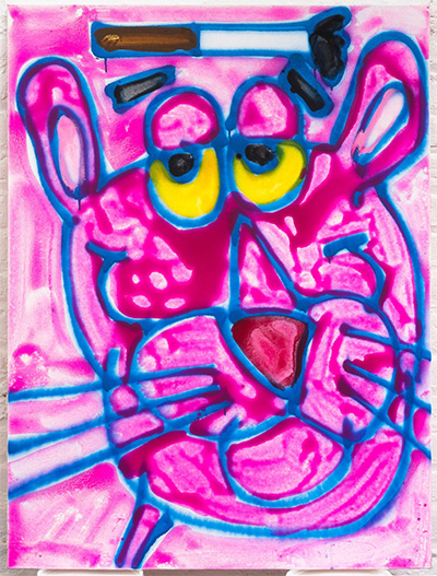
Pink Panther + a Cigarette, 2016
Acrylic and spray paint on canvas
Overall: 40 × 30 in. (101.6 × 76.2 cm)
Courtesy of the Artist, CANADA, New York, Carl Freedman Gallery, London, and Xavier
Hufkens, Brussels.
Contemporary art lovers have until July 9 to see more than two dozen of Katherine Bernhardt’s colorful, large, curious paintings on canvas and paper at The Modern Art Museum of Fort Worth.
Currently based in New York and represented by the gallery Canada, Bernhardt is a painter who studied at the School of Visual Arts and School of the Art Institute of Chicago. She has exhibited internationally in galleries and museums, and had her first solo museum show at the Contemporary Art Museum St. Louis, which just closed mid-April. As part of The Modern’s FOCUS program, Bernhardt is one of three artists to have a solo exhibition this year organized by The Modern for the Director’s Council, a group formed in 1985 that supports The Modern’s acquisitions.
The imagery and style of Barnhardt’s works are different than what some conventional museumgoers may expect, but The Modern’s selection of the artist’s work does not disappoint. The exhibition is an overview of the works for which this artist is best known: large scale motifs, often referred to as “pattern paintings,” that feature a range of items like bottles of Windex, rolls of toilet paper, cigarettes, Sharpie markers, basketballs, watermelons, sharks and more.
At first look, the items she depicts in her paintings might seem unrelated, but they are not random. Cleaning supplies, nicotine delivery, and other characters role-play in an honest portrayal of the habitual, obligatory, and playful aspects of Bernhardt’s daily life, inside and outside the studio. For example, Barnhardt’s series of Pink Panther portraits are a result of her young son’s obsession with the cartoon while they were on vacation. “We were in Hawaii, staying at the ‘Pink Palace,’” she says, “and he was obsessed with the Pink Panther.” Simple as that.

Four Philodendrons + Toilet Paper, 2016
Acrylic and spray paint on canvas
Overall: 72 × 60 in. (182.88 × 152.4 cm)
Courtesy of the Artist, CANADA, New York, Carl Freedman Gallery, London, and Xavier
Hufkens, Brussels.
Her painting style is anything but stuffy; rendering has no place in her compositions. Instead, her representation is loose and gestural, often incorporating a deft use of spray paint while creating the pieces on the wall or on the floor, for works as large as 10 and 15 feet. The immediacy of an idea and its execution, in combination with her use of acrylic paints as a dye-like medium—thin, fluid, and slightly transparent—and spray painted outlines of her subjects lend a humorous spirit to her paintings. And with literal, matter-of-fact titles like Plants + Poop + Toilet paper + Whatsapp, many views may nod their heads in agreement that in fact, yes, it’s kind of funny that on any given day, we may find ourselves in the bathroom, on the phone. Or, as in One Cigarette On Black In Green, sometimes a cigarette is all you want.
Bernhardt demonstrates the same level of skill in executing a painting whether she is depicting a cartoon character or a real life object. Rich magenta, deep blue and turquoise, hot pink, and bright green and orange dominate the works in the exhibition, with imagery resulting from the spray painted outlines of bold, generalized forms while details in the images often rely on how the paint pools, bleeds, and drips. For example, a cigarette: one rectangle, half white, half brown, outlined in any color of her choosing, and capped with a small explosion of black paint. Or, the black seeds of a pink watermelon, Pink Panther’s whiskers and signature floating eyebrows, the general shape of a bunch of bananas, and the eyes of the ever-popular poop-pile emoji.

Aqua Fresh+ Toothbrushes + Cigarettes+ a Vine, 2017
Acrylic and spray paint on canvas
Overall: 60 × 48 in. (152.4 × 121.92 cm)
Courtesy of the Artist, CANADA, New York, Carl Freedman Gallery, London, and Xavier
Hufkens, Brussels.
Her works have been said to contain symbology or hieroglyphics, and she points to graffiti and textile patterns, especially Dutch wax printing on African fabrics, as influences (Bernhardt also owns a rug-importing business; “The rugs are works of art in themselves and, whether subconsciously or not, are a major influence,” she says). And readers who pay attention to design trends on image-based platforms, such as Pinterest and Instagram, might also recognize in Bernhardt’s paintings the flat lay method—an arrangement of objects shown most often from above to achieve a flattened, or patterned, look.
Often described as “vibrant and youthful,” these are paintings by a mature artist who is incorporating elements from the life she has built for herself and her son, as well as the elements of that life which might be out of her control. But that’s what makes her works relatable and, honestly, fun. Here, “fun” means taking notice of objects, designs, and repetitions—elevating the material stuff of life and acknowledging the roles it plays in constructing our own patterns.
—NANCY ZASTUDIL

