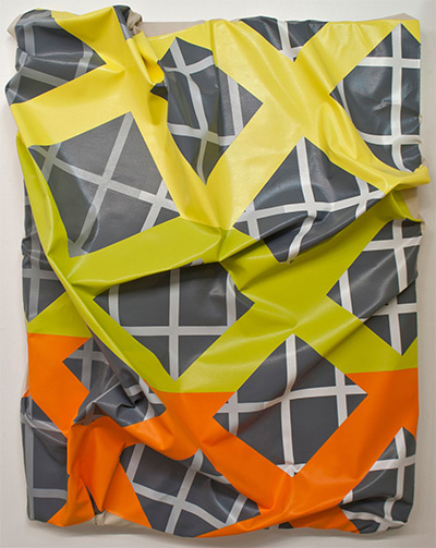
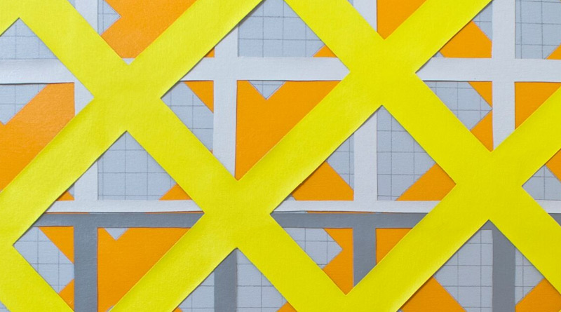
Timothy Harding, 40” x 32” on 41” x 34”, 2015 acrylic on canvas 41 x 34 inches.

Timothy Harding at Cris Worley Fine Arts
Cris Worley Fine Arts characterizes the geometrically inspired work of Timothy Harding as “a sarcastic laugh at the undoing of the pristine grid and a simultaneous nod to its persistence.” It’s a clever statement and one which precludes a critic from taking Harding’s playful abstractions too seriously.
Harding’s work, which is on view at Cris Worley through May 7, carves out a space for itself in between art forms: although the work is mounted on the wall, the obtrusively imperfect three-dimensional nature of most of the pieces means the work has more immediately in common with sculpture than drawing or painting as we traditionally conceive of it.
Skin is the title of the body of work on view at Cris Worley, the first solo exhibition at the gallery by the TCU grad. In the title Harding seems to be referring not to organic skin but rather to the artificial material with which billboards and other forms of information-laden content are “skinned;” his acrylic work having more in common with digital design-driven styles prevalent in the 21st century, artistic styles which absence the artist’s hand in favor of pristine lines and arcs.
But Harding confuses a viewer’s experience of his material in numerous ways. First off the work is mostly content-free and highly formal. Instead of information, Harding’s acrylics on canvas are situated firmly in the art historical world of abstract expressionism and minimalism, styles of art interested in drawing viewer’s attention away from the content towards a focus on pure form and geometric elements such as the line.
Harding’s contribution to his art historical lineage seems to be at the interesting intersection of the action-laden formal elements of the abstract expressionists and the absence of the artist’s hand in much of minimialism; his messy crumpling and destruction of the heretofore (we imagine) immaculate acrylic on canvas places his work in a space between.
He further complicates the intersection by using acrylic-based paint, inhabiting his work with an aura of the impersonal, something to which we have grown accustomed, and something which unfortunately persists despite the artist’s clearly intentional crumpling of the canvas.
It’s immediately clear what Harding is working with and Worley, in her statement on the work, is not wrong: the work clearly alludes to a grid that despite destruction, persists. Where the work disappoints is in the seemingly incomplete contrast between the perfection of the grid and the impersonal paint and disorder of the three-dimensional canvas which disruptively juts out into space; the contrast rings hollow, the order and disorder brought together in a manner that cannot escape its contrived origins. I wanted an eerie and grating disconnect between Harding’s clever experimentations with form and space, but instead Harding’s work exhibits an all too obvious and seemingly half-hearted attempt at illustrating the paradox of geometric perfection and the imperfection of the human hand.
—JENNIFER SMART

