When Jessica Halonen answers my phone call from her studio in San Antonio, I’m dying to ask her about one thing: poison.

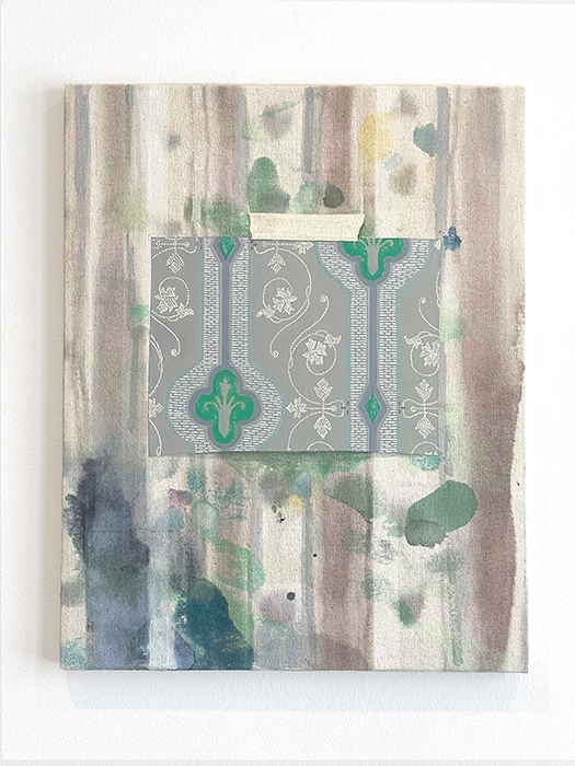
The PM paintings combine abstraction and trompe l’oeil, two of Halonen’s driving artistic concerns, dating back to the work she made while earning her MFA at Washington University in Saint Louis. For example, the inky stained and striped background of Specimen 25 (fleur de lis) (2022) reads like a faded painterly modernist composition on which is “taped” a smaller piece of fleur de lis-patterned wallpaper.
Last summer, selections from Halonen’s PM series were included in the exhibition Anthology at David Shelton Gallery, alongside works by Erin Curtis, Sara Frantz, and Raychael Stine.

“The matter of simply turning through the pages in a book would have been almost more dangerous, or just as dangerous, at least,” Halonen explains. “That fascinated me.”
That kind of fascination has guided the artist, an associate professor of art in the Department of Art and Art History at Trinity University in San Antonio, in a research-based art practice for more than 25 years. In addition to teaching and exhibiting her work, she has participated in residencies and fellowships at MacDowell in New Hampshire, Artpace, the Core Residency Program at the Glassell School of Art, and Kunstlerhaus Bethanian, Berlin.
But it’s not just green that has caught her eye; she has engrossed herself in the history of other pigments, too— small bits of broader stories. Through the course of visiting museums during her time in Berlin, she came across a small bit of information about Prussian blue, also called Berlin blue, learning that it was the first synthetically produced pigment, created by pigment and dye producer Johann Jacob Diesbach in the early 1700s, almost entirely by accident. A trip down a rabbit hole ensued.
1 ⁄7
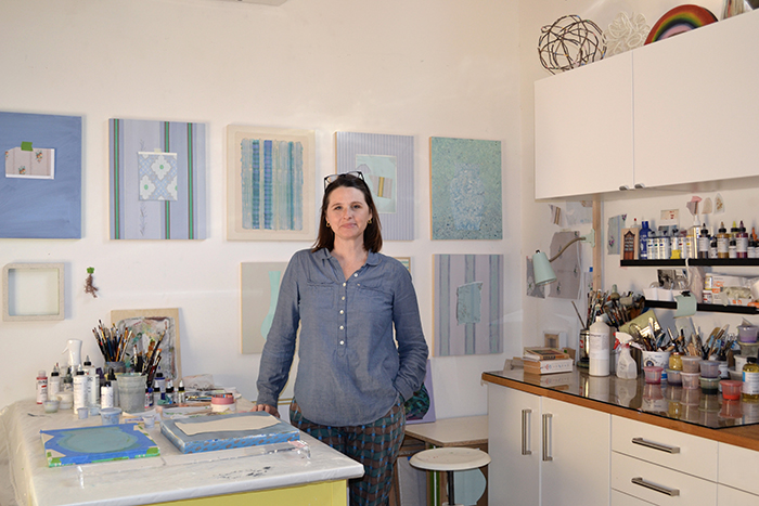
Jessica Halonen in her studio. Photo by Elaine Yasumoto.
2 ⁄7
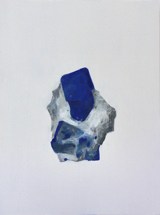
Jessica Halonen, Original’s Habit (Lapis), 2015, Oil on panel, 10 x 8 inches. Photo courtesy of David Shelton Gallery.
3 ⁄7
Jessica Halonen, Untitled (Palace of Tears), 2015, Acrylic on canvas and linen, diptych, 32 ½ x 23 ½ inches. Photo courtesy of David Shelton Gallery.
4 ⁄7
Jessica Halonen, Specimen 25 (string), Detail, acrylic on canvas on panel, 20 x 16 inches. Photo courtesy of David Shelton Gallery.
5 ⁄7
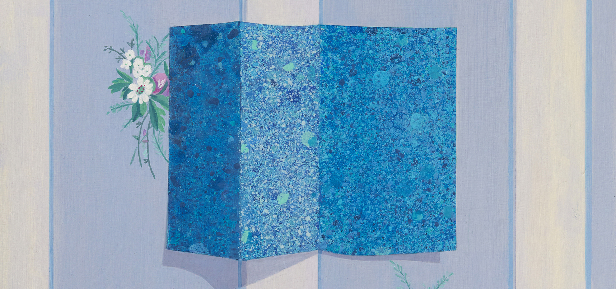
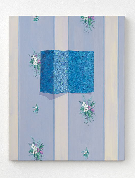
Jessica Halonen, Wallpaper 69 (landscape), 2022, acrylic on panel, 20 x 16 inches Photo courtesy of David Shelton Gallery.
6/7
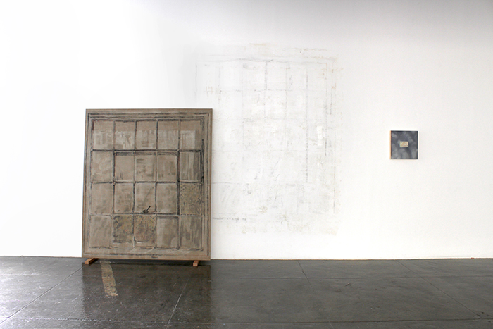
Jessica Halonen, Sorry I haven't written, 2019, Installation view, Left to right: Untitled Window (Opaque Ghost) & Untitled (Helicopter). Commissioned by Artpace San Antonio, International Artist-In-Residence program.
7 ⁄7
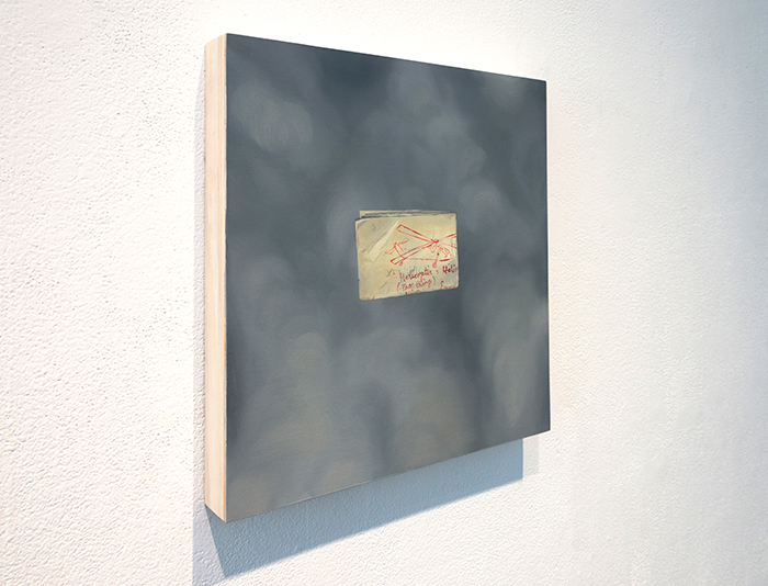
Jessica Halonen, Untitled (Helicopter), 2019, Oil on panel, 14 x 14 inches. Commissioned by Artpace San Antonio, International Artist-In-Residence program. Photo by Ansen Seale Studios.
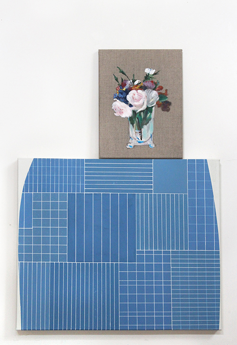
Untitled (Palace of Tears) (2015) refers to the Tränenpalast, or the Palace of Tears, a checkpoint between East and West Berlin where friends and family would meet and then be forced to say goodbye, not knowing when they’d see each other again. On top of the blue-and-white grid-patterned painting—a nod to the building’s facade—sits a smaller painting of a singular bouquet, Halonen’s reproduction of a painting by Manet titled Bouquet of Flowers in a Crystal Vase (1882), believed to be the very last painting that he ever painted. The melancholic undercurrents run strong.
“There’s always some other reason why I’m choosing these things that might seem, on the surface, a bit didactic,” Halonen says.
For her 2019 residence and subsequent 2020 exhibition at Artpace in San Antonio, Sorry I haven’t written, Halonen created works informed by her father’s experiences as a military helicopter mechanic during the Vietnam War. Untitled (Helicopter) (2019), depicts a folded sheet of worn, yellowed paper with red-penned handwriting and a drawing of a helicopter, floating in a hazy gray background. She had found the paper among her father’s military draft records and other official documents.
“The note was folded, and the edges were worn…I could just tell that it had lived for a long period in his back pocket,” says Halonen. “It just felt that way.”
Halonen tells me that she is currently developing a project based around a small group of British designers who worked together with scientists in the mid-20th century to produce domestic objects including wallpapers, fabrics, and dinnerware that utilized scientific diagrams from what was then a new field in the sciences called crystallography—fitting for an artist who is interested in the intersections of art, science, and history.
“Going down that rabbit hole has led me to one particular scientist named Dorothy Crowfoot Hodgkin, who spent over 30 years of her life developing crystallography and learning to understand the molecular structures—one of which was the insulin molecule, which I’m very interested in,” she says.
As for that poisonous wallpaper, Halonen’s paintings schooled me on the color green. Whether pure pigment or mixed with others, it was a dead giveaway for the presence of arsenic in the late 1800s. But because of the artist’s technical skill, aesthetic choices, and conceptual underpinnings, the artworks stand on their own merit.
“It’s not so important to me for the viewer to kind of totally understand the story behind my artwork. In fact, I’m more excited when they like it for other reasons.”
—NANCY ZASTUDIL