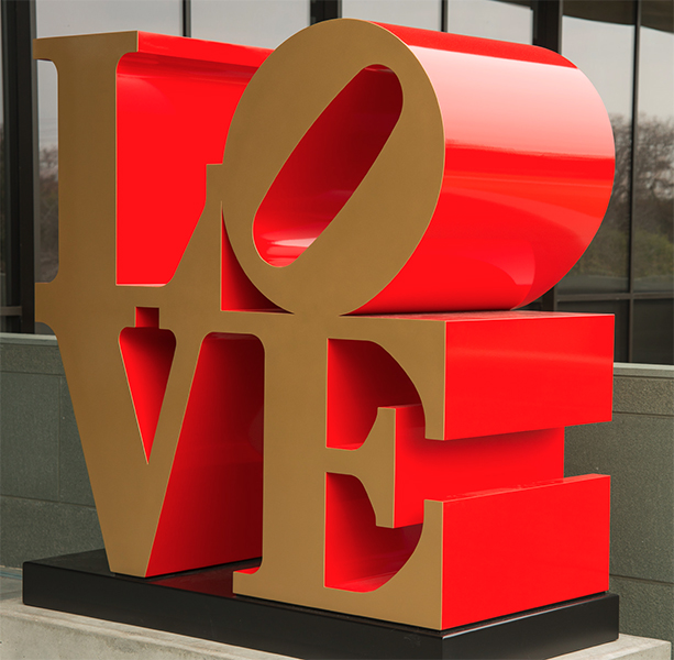
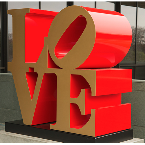
Sometimes LOVE is all-consuming. Nowadays, Robert Indiana’s iconic LOVE artworks—with their clunky capital L and tilted O stacked over the V and E—are everywhere. But not everyone who knows the piece knows how much it tormented the man who made it. Originally created in 1964 as a Christmas card design for New York’s Museum of Modern Art (MOMA), LOVE soon spread from Indiana’s own prints, paintings, and sculptures to keychains, tee-shirts, postage stamps, and a host of other uncopyrighted, unsanctioned stuff. In a sort of Pop Art fantasy scenario gone sour, Indiana’s piece was so popular that the artist completely lost control of it. LOVE came to define and almost destroy Indiana, who died in 2018.
Actually, strike that: despite his candy colors, American dream themes, and stenciled texts, Indiana hated the label ‘Pop.’ “I’ve never been that fond of that term,” the artist says in a 2013 video interview, explaining, “I’m a sign painter.” To prove it, he pulls out a recent sign design he made for a friend’s seafood restaurant.
Indiana’s insistence on identifying himself with signs over Pop probably had something to do with his fraught relationship with the art world. But it’s also part of his lifelong determination to be in charge of his own story. Adopted by an Indiana couple as an infant, the artist changed his last name from Clark to Indiana—his nostalgic, national “nom de brush” —to stand out after moving to New York City in 1954. There, he palled around with Andy Warhol, dated Ellsworth Kelly, and kept a studio a short walk away from Agnes Martin’s. But while his peers took on mass media and pure abstraction in their works, Indiana looked inward for inspiration.
Early on, Indiana adopted the language of signs. But skirting the line between graphic design and fine art was risky. “It wasn’t the way artists worked back then,” Barilleaux told me, and “(Indiana) permeated so many different worlds by crossing those boundaries.” For example, at the 1964 World’s Fair in New York, his large metal EAT piece had to be taken down within 24 hours because so many hungry visitors gathered around it expecting to find a restaurant. As with LOVE, Indiana’s artworks did what signs are supposed to do: they draw people in. And underneath Indiana’s seemingly-generic words and symbols lay personal meaning: EAT remembered the artist’s mother, who worked in roadside diners during the Great Depression, and whose last word to Indiana was the caring command, ‘eat.’
1 ⁄ 8
Robert Indiana, LOVE, 1966, cast 2002. Painted aluminum. Collection of the McNay Art Museum, Museum purchase with funds from the Russell Hill Rogers Fund for the Arts. © Morgan Art Foundation / Artists Rights Society (ARS), New York.
2 ⁄ 8
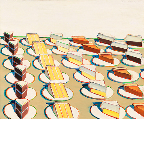
Wayne Thiebaud (b. 1920), Pie Counter, 1963. Oil on canvas, 29 13/16 × 35 15/16 in. (75.7 × 91.3 cm). Whitney Museum of American Art, New York; purchase with funds from the Larry Aldrich Foundation Fund 64.11. © 2020 Wayne Thiebaud / Licensed by VAGA at Artists Rights Society (ARS), New York.
3⁄ 8
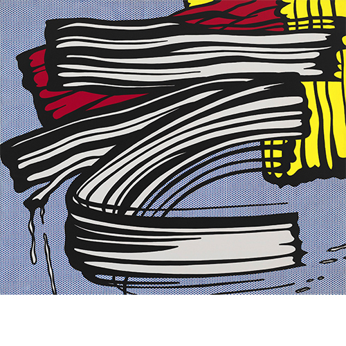
Roy Lichtenstein (1923–1997), Little Big Painting, 1965. Oil and acrylic on canvas, 68 x 80 in. (172.7 x 203.2 cm). Whitney Museum of American Art, New York; purchase with funds from the Friends of the Whitney Museum of American Art 66.2 © Estate of Roy Lichtenstein, all rights reserved.
4 ⁄ 8
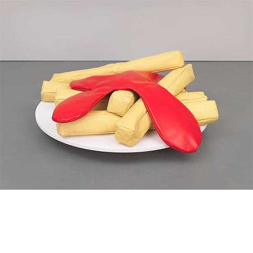
Claes Oldenburg (b. 1929), French Fries and Ketchup, 1963. Vinyl and kapok on wood base, 10 1/2 × 42 × 44 in. (26.7 × 106.7 × 111.8 cm). Whitney Museum of American Art, New York; 50th Anniversary Gift of Mr. and Mrs. Robert M. Meltzer 79.37a-g. © Claes Oldenburg.
5 ⁄ 8
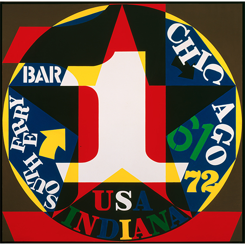
Robert Indiana, Decade: Autoportrait 1961, 1972-77. Oil on canvas. Collection of the McNay Art Museum, Gift of Robert L. B. Tobin. © Morgan Art Foundation/ Artists Rights Society (ARS), New York.
6 ⁄ 8
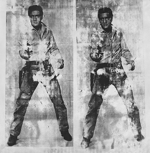
Andy Warhol (1928-1987), Elvis 2 Times, 1963. Screenprint and aluminum paint on linen, 82 11/16 × 80 3/4 in. (210 × 205.1 cm). Whitney Museum of American Art, New York; gift of The American Contemporary Art Foundation, Inc., Leonard A. Lauder, President 2002.272. © 2020 The Andy Warhol Foundation for the Visual Arts, Inc. / Licensed by Artists Rights Society (ARS), New York.
7 ⁄ 8
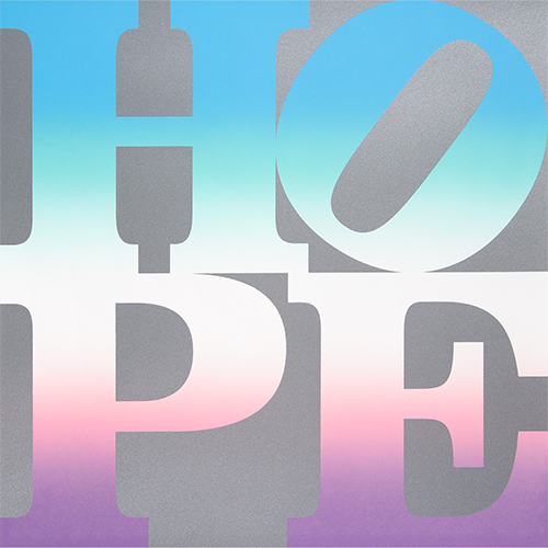
Robert Indiana, Sheet from Four Seasons of Hope, 2012. Screenprint. Gift of Michael, Leif, and Simona McKenzie, American Image Art. © Morgan Art Foundation / Artists Rights Society (ARS), New York
8 ⁄ 8
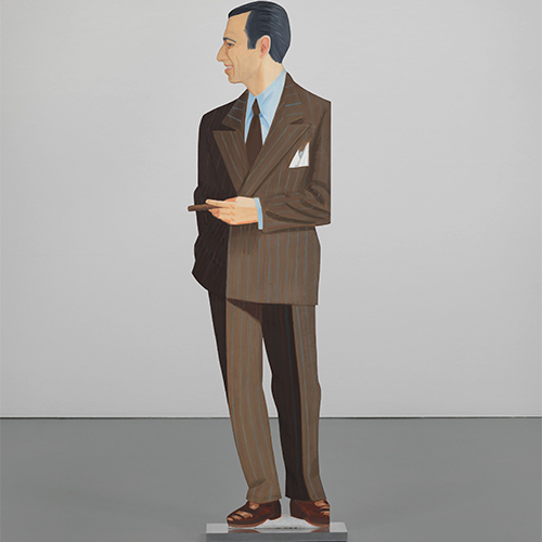
Alex Katz (b. 1927), Alex, 1968. Oil on aluminum, 71 3/4 × 18 3/4 × 4 1/2 in. (182.2 × 47.6 × 11.4 cm). Whitney Museum of American Art, New York; gift of the artist in honor of Leonard A. Lauder 2003.432. © 2020 Alex Katz / Licensed by VAGA at Artists Rights Society (ARS), New York.
Similarly, the color scheme of the original LOVE design came from the red and green of Phillips 66 gas station signs (Indiana’s father worked for the company) standing “against the blue Hoosier sky,” according to the artist. Others have said that LOVE’s colors were taken from Ellsworth Kelly’s palette. Either way, cross pollination is at the core of the McNay’s new show. Of the nearly 90 works on display, 50 are by other artists, including Pop pioneers like Andy Warhol, Roy Lichtenstein, Claes Oldenburg, and Wayne Thiebaud.
Though he began his career working among these art stars, the LOVE fiasco embittered Indiana against New York City and its art world. In 1978 he escaped to the small island town of Vinalhaven, Maine, where he would remain until his death. There, Indiana felt a kinship with Mardsen Hartley, a fellow gay painter who’d lived in Vinalhaven 50 years earlier. Indiana’s 1990 screenprint series The Hartley Elegies reworks his predecessor’s experimental imagery. Along with Charles Demuth—another turn-of-the-century gay American painter who heavily influenced him—Hartley represented a line Indiana wanted to follow, where abstraction and symbols carried potent autobiographical potential.
The McNay’s exhibition shows Indiana looking back, but also looking forward. “Indiana’s art really anticipated the global digital moment we’re experiencing today with short, direct, text-based bursts of communication,” writes Barilleaux. To that end, the show features multimedia works by contemporary artists who work with text and image, including several Texans like Jesse Amado, Chad Dawkins, Alejandro Díaz, Ethel Shipton, and others. For them, Indiana’s work—its bold failures and innovations—is a signpost.
But as highway signs go, it’s the most current one that counts. To that end, the museum has also commissioned Brooklyn-based poet, artist, and designer Annika Hansteen-Izora to create a suite of six new web-based, digital works for the exhibition. Hansteen-Izora’s ephemeral but insistent messages affirming the beauty and value of queer Black life are a crucial counterpoint to Indiana’s specific, space-taking Americana vision (as in big white male object oil-painter vibes). Indiana lived at a time before social media gave us a way to control how our creations move through the world, but Hansteen-Izora’s generation are experts. Still, this new show argues that what counts isn’t Indiana’s LOVE, but his legacy.
—LAUREN MOYA FORD

